9.23.2012

92212_kc star illustrations and animation

 These are two of seven illustrations I did for the KC Star this past week! It was a blast to be able to work in a really limited palette like this.


Also, I've been messing around with animation in Flash. Sorry, this is kind of a ragtag post. I'll put more up sooner or later.

eth.

9.06.2012

090612_trench coat man

[insert apology about not posting enough here].
[insert citations of video games and other current issues plaguing productivity here].
[insert optimistic statement suggesting newfound resolve to increase posting frequency in coming weeks here.]

Good, that part's done. I sketched this guy in 40 minutes or so the other night, basing it off a sketch in my sketchbook.
I'm still struggling with monotony in the the use of digital brushes in my work. I find that either I approach my work with complete exclusivity when it comes to my brush use, like in this piece, and then the brushwork becomes completely irrelevant, almost invisible, OR I try to use a variety of brushes and it just becomes chaotic and disjointed.

I'm going to have to just start making new brushes and abandon my habits all together. More on that later.


Note: I don't think I'm allowed to call this garment a trench coat because it has a hood.


[insert initials here followed by period]

8.28.2012

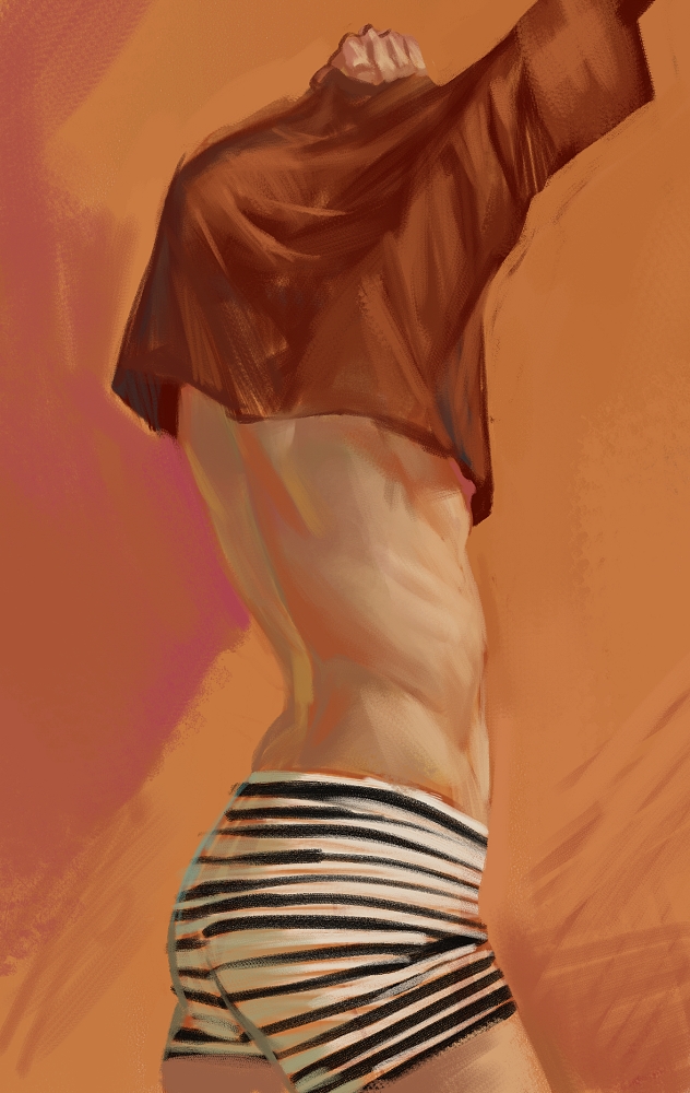
082812_late night sketch


I've been way too busy these past few weeks between my internship at MK12 and my part time job which means I get no time to do my own stuff. I've been drawing a lot in my sketchbook but rarely do I get to touch color.
     This is a 30 minute sketch I stayed up late to do while listening to the Escape From Illustration Island podcast.

     I'm really interested in caustic color right now, I'm particularly in love with the work of Robert McGinnis because he's incredibly brave and bold with his pinups. The way he paints flesh is usually not in such a way that it's believable, or even has blood pumping through it, but the women become chameleons in their environments, fusing with the color compositions or fighting against it.
      I really admire this boldness because I feel it flies in the face of a lot of what I see more commonly practiced today in illustration which gravitates toward the perfect peach flesh tone in pinups of white women. I don't say that necessarily disparagingly, because I adore Gil Elvgren, who I feel is the supreme master of that Coca-Cola babe complexion, but it is really refreshing to see a figure become almost sickly looking because of the color relationships within the image.


   Sooo what am I trying to say? I guess in the exploration of my own work there are some things that I need to define for myself, one of them is how I'd ideally like to use color. I have undying respect for the way some of these artists use graphic shapes and since I've become obsessed with the Mod aesthetic recently, it's natural that I would gravitate more toward graphic color and shape. I don't quite know how graphic I will get but I feel myself being pulled. Thanks for reading.

eth.

8.13.2012

31312_speedie sketches

A bunch of silly sketches. Nothing too fancy or finished. I need to escape this color of blue, it's become a little bit too much of a staple of my work and I don't really care for my work to become a parody of itself. Pardon the sloppiness of these, they're all relatively quick pieces. 30-60 min.


eth.

8.03.2012

mudboxing

Well folks, I'm back after a short break. Things got busy this past week and I've been trying to recover. I feel like that makes me sound like a real weakling, that whenever something rocks my boat I take a week off to recover. The real problem is not that I stop painting or drawing, but that I stop doing personal work. And that's a problem. That aside, I don't really have a problem showing/discussing weakness because I'm not a consummate human being really. I do, unfortunately, slack off (curse you TF2!) and waste time on stupid stuff.
Buuuuut I'm getting back on the horse, and this time, in the form of 3D modelling.  I know it needs to be a part of my portfolio soooo this is what I did to start. Mudbox has a really friendly user interface that I could quickly wrap my head around and mess with the hotkey settings until I felt like I was painting in Corel Painter, my weapon of choice.

I knew I should work from some point of reference in this exercise, so I chose this guy:


Bad idea. First off, it was really difficult working from an unresolved sketch and I ended up abandoning perhaps much of what is there because it was either above my skill level to accomplish with my tools, or just nonsensical. It made it very clear to me that I need to push so that my own designs are much more structural and clear in every way possible. 
My sketch above has some ambiguous dome head, no definition to the ears, and very little structure in the face. I had to really work to keep him from turning into Yoda.
I've included a couple of shots, feel free to comment and critique -- I would love the opinion of somebody that knows more about 3D modelling than me.


2 hrs. Mudbox 2013.

eth.

7.25.2012

pulp sci fi sky

 Hey everybody, I'm finally getting back to being able to make work after a particularly busy last week and I've been wanting to add some new work to my portfolio that deals more in specific genres, like science fiction, while embracing what I love visually about those genres. And so, this came about.
Originally I just wanted to do something with lots of atmosphere that embraced the look of old pulp science fiction art like that of Frank R. Paul. This is a far cry from Paul's work but I am in love with the bold graphic yellow backgrounds of those old covers and was interested to see if I could adapt it to a more contemporary look. Anyways, this is what happens after I tinker with it for a bit.


1.5 hours in PainterX.


This second image is a sketch that I did when the idea for the coral hive trees struck me. I quite often find myself coming up with ideas purely because of the way I imagine light would interact with it. Shape is, of course, extremely important, but sometimes I just want to see color shifts.

I'm really interested in exploring more of this pulp material to see how one could adapt monsters from that era so they would fit into a present day sci-fi horror film! Soon to come...
eth.

7.18.2012

matte painting

This is something I forgot to post from a bit ago. I got to do a little bit of matte painting this past semester for a friend. Here's my work...I had my work cut out for me because I was limited in what areas I could paint due to the footage being very busy.
eth.

pen and pencil

Here's a bunch of sketchbook pages I scanned today. They very in date. One I did two days ago but the rest are pretty old...from April. Yep!


eth.

7.16.2012

71512_funny little experiments

These two funny little experiments I was working on today...didn't quite get to finishing, though. I've been making new brushes in painter lately, definitely struggling a bit as well. I've been feeling like all of my paintings have a sense of sameness in the brushwork, which I cannot quite live with.


I particularly admire the work of Sergey Kolesov and Jaime Jones. They are both tremendously fantastic painters. Jaime also recently wrote a blog post about his process with images to accompany it. It's really fascinating to see the way in which other people work. I felt a strange reassurance from seeing that post because I often feel like my own process is a little backwards or unconventional by digital painting standards. I tend to be very direct in my paintings and often times I only work on one layer, which means no going back. I think I might try to construct something of a process video of my own since I can imagine it's constructive for the artist as well.

In any event I've been considering dedicating myself to a personal project for a bit...or several. I find that it's very difficult for me to make work when I don't have a prompt, or limitations. I'd like to make my work more self-indulgent. We shall see where it goes from here. Thanks for reading.

eth.

7.14.2012

071412_sketchbook pages

Hey everybody! This is what I draw in my sketchbook. Not exactly recent things, but I haven't gotten around to scanning lately and I still wanted to share. I'll do my best to post more regularly. 


This last one is a series of 15 min studies I did because these are the things I struggle with. Early morning atmosphere. Foggy midday weather and diffuse lighting. Hard edged objects.
Thank you for looking!

eth.