7.11.2012

MK12 concept art

I've had a very busy recent few weeks, partially because of my current internship as a concept artist at MK12! It's a fantastic Kansas City-based studio full of very smart, very talented people that do some awesome work. Definitely do take a look at their new reel if you want to be just plain visually inspired. It's all wonderfully bold, graphic and sharp. They have a great sensitivity toward the use of color in their work that can't be beat!


What I have been doing there has absolutely nothing to do with those pieces though, I am a part of a new short film project that they're working on that I've had the pleasure of doing concept art for. 
Here are a handful of images I'm allowed to share for the time being.
You can see more of how they work and what they do, as well as these images on their blog.
Thanks for taking a look, more things to come...


eth.

6.21.2012

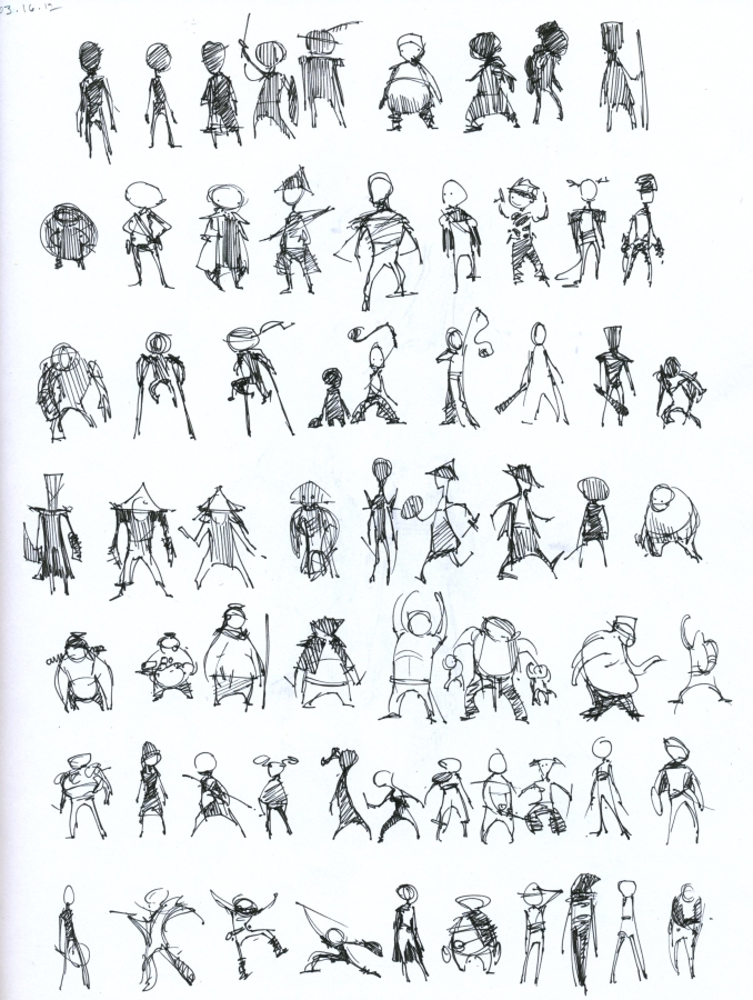
062112_warmups

The morning warmups. Two 20-30 min sketches.
eth.


062112_landscape paintings.

It seems there's a certain color palette I'm attracted to right now...I'll need to break myself of it very soon but for now I'm enjoying blue green.


2 hours. PainterX. 

eth.

4.08.2012

040812_ sketchings

I've been spending a lot more time in my sketchbook recently, which is hugely beneficial. The top piece is a 30-40min speedpainting...I wasn't really counting. I worked on a matte painting for a friend's film recently and it made me suuuper aware of  atmosphere, quite a good exercise! I couldn't help but slap some super saturated tones into this one though.


3.27.2012

032712_practicing that animation design style!

Here's a piece you haven't seen, and another which you have, but not this resolved. They're mostly for my previously mentioned pixar internship portfolio, but they're still really fun as just quick production painting challenges. I rarely let myself do pure character design, it's almost always something in the context of a scene, which I think strengthens the character overall, but is more time consuming. 
The astronaut men took about 30-45 min a piece. I definitely got faster with each one I did. 

eth.

3.25.2012

032512_WIPs...


Here's the work in progress stuff I've got going on at this moment. They're all probably about 1 hr into painting. 


It's interesting to me how while they're more abstract like this you tend to just see the palette that I'm using, rather than the subject matter. Especially looking at them in thumbnail form. I find myself slowly migrating away from brighter colors. I think I originally gravitated toward them because I was excited to learn and understand color better. Now that I have a little bit better of a handle on things, I'm interested in pursuing more earthy color palettes, just because I don't really know how to approach them. So I've been doing speedpaintings! These are each like 15 minuters
The biggest problem for me in pursuing different palettes I think is going to be figuring out how to work with value in that way. When you're working with separated highly contrasting colors, it's a lot easier to create distinct shapes and depth in space. 

As soon as you start using more chromatically similar colors, some other form of contrast, be it texture, value, or just simple design has to step up to fill the gap. I think why this sketch was a failure is because I'm trying to create a sense of depth and space just by choosing different colors and hoping thats enough, but because I'm limiting their saturation and overall vibrancy, they're basically a painting confined to two values, and those aren't even descriptive of their position in space! It would have worked better if at least everything in the foreground was dark and the background was light.

These are my thoughts, please share yours if you're so inclined. Or if you're reading this.

eth.

3.22.2012

Trying to learn from Pixar

I'm gearing up to apply for an internship at Pixar and I realized that I have very little that demonstrates storytelling in the vein of animation. I have loads of background paintings from previous work, but not a lot of character oriented stuff.

I own a copy of The Art of the Incredibles and what I thought was so remarkable about the designs in that book are the fact that the best ones are all collage! I've only experimented with collage here and there but I definitely saw it's power when I did. Below are some examples of some character design collage stuff that I did my freshman year, it was a complete blast. This one to the right is obviously from the Incredibles.
What I found to be incredibly powerful about this process is that while you had absolute control over the process, you were working with a very limited palette, meaning you could only create through what you could find in old magazines.


 It definitely made me consider the shapes of the characters that I was creating because you had to cut everything out by hand. I would love to try to find a way to emulate that process digitally of being restricted through outside sources for texture and information. I may have to experiment with the clone tool a bit in the future... anyways. Yes. You can get some interesting designs completely by accident using collage and you have no choice but to focus on shape, color and texture.

That emphasis on shape is the hallmark of animation because it's a medium that relies on its audience being able to read the visual stereotypes ( to steal from McCloud) to further the narrative even as the characters first are appearing on the screen. with these sketches I was hoping to play with some imagery that I already enjoy but use color more in the way that I see pixar doing it, and pay more attention to the shapes the characters occupy.

 I think these last color keys are a little weak, but they are just meant to be experiments and as such, they can slide.
Please give your comments and especially critiques if you've got em.
eth.

3.18.2012

KC Star Illustrations

So I am currently an illustration intern at the Kansas City Star and these are a bunch of illustrations that I did which were recently published. The internship as a whole has done a great job of making me more versatile and experiment a lot more. These illustrations were all done for a summer camp guide piece in the paper.
I'll post some more of the work that I've done there a little later.

eth.


3.16.2012

031612_process

I'd like to put more progress works on here because I rarely get to show those things otherwise. So here's that stuff.