7.15.2013

Buggin' Out - Nashville Scene illo

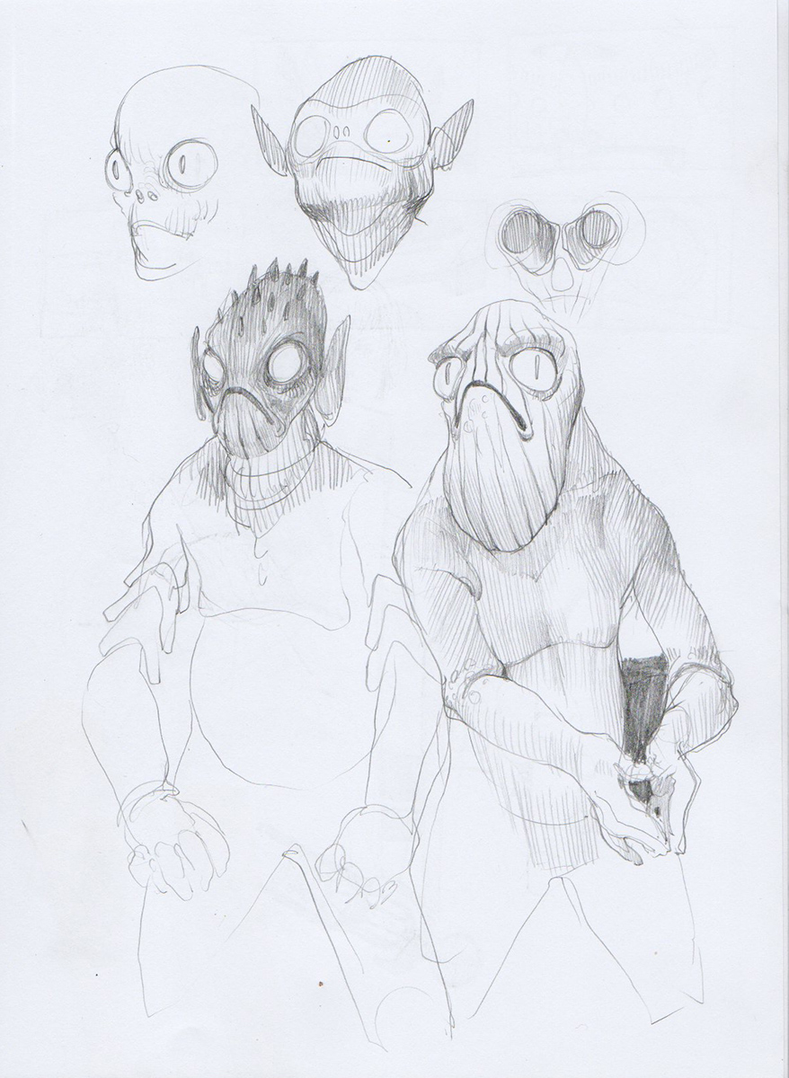
Here's an illo I did for the Nashville Scene last week with Art Director Elizabeth Jones, who was phenomenal to work with. It was a busy week but I know I couldn't pass up an opportunity to do something like this. Too much fun. Here's the a link to the article that it was for!

Also, I've been thinking about doing some livestreaming a lot lately. It seems like a great way to connect with other artists as well as to talk about process and share information. So I may post something about that soon!


eth.


7.11.2013

mech wips...

The very beginnings of some things....I've tried blending the 1950's with giant mechs before but usually to no avail, but I've been playing with some ideas, so hopefully they turn out.


eth.

7.10.2013

Morning pinup

So this one has been sitting in my pictures folder unfinished for a while, and I'm not sure this is actually finished, but it's enough to be called resolved. 

There were a handful of conditions that I had set up to decide whether or not this would be successful in my eyes. One was just to capture how that halo of light in hair feels in a backlit figure, another was just painting a  completely backlit figure in general, which is always hard. And finally, try and set up a cacophonous palette of acid pinks and purples, and figure out how to reconcile them.

The result is this. It's got its' rough patches, but I got some things right. And I was also more value conscious than I normally am, and that's a step in the right direction. I've included a black and white version as...proof?


 eth.

6.13.2013

Assorted flavors of May and June

Need to learn to post more frequently than once a month. Here are some various things. All of them silly.


5.07.2013

hodge podge


Here are a hodge-podge of things. I'm dabbling in comics a bit right now. Just read Bill Sienkiewicz/Frank Miller's "Elektra Assassin" a couple weeks ago and i'm still reeling from it. It is just such a potent work overall. Probably one of my all time favorite comics, it's such a visual fiesta.

So anyways, I've been doodling dumb stuff, did a study of a cadillac in 30 minutes and then tinkered around with some other things. The last image is unfinished fanart of Vivienne Michel from Ian Fleming's "The Spy Who Loved Me" in ridiculous technicolor. Not so much the character from the film as what I imagine she'd look like from the book, right before company shows up. I don't know if I'll ever actually finish it.


eth.

4.11.2013

041113_ too long

It's been way freaking way way freaking too long since I've posted and I am done with that. That being not posting. I've been getting caught up in the crap of being a professional and liking games like CS:GO too much. 
Of course, playing isn't bad, in fact, I make new distinctions about art every time I play another video game. Working in the industry certainly makes you attuned to every little thing about the craft of game making. 
I recently began playing Age of Empires II HD with some of my family, like old times, and I've been really blown away by how much is done strictly to serve the the player. There is no slavishness to realism in the visual sense. Horses are as big as houses, etc., everything has a consistent visual hierarchy which makes discerning what is happening on screen actually feasible.

But that's just a ramble. Someday I might try really writing/talking/videoing about these nice visual qualities in games and all of the smart decisions that are made by some art peoples in the games industry.

Enough chat. Here are selection of scans from the past couple of months in my sketchbook. I'm ashamed that there are not more that I actually like. I've allowed my relationship with my sketchbook to become a little too casual. All of these are pretty much graphite and ink.
My tools of choice for anyone that is curious:
.05mm Pentel Twist Erase mechanical pencil
.03mm Copic Multiliner
.03mm Pilot Hi-Tec C


Thanks for looking.
eth.

3.19.2013

Thoughts about stuff and space.

I'm still fighting to get out of my rustiness, but this is some really self-indulgent work that I did. 


It's also worth noting that a lot of the work I've been doing lately would be completely impossible without some good influences:

My girlfriend Rachel, whose work can be seen here: http://www.rachelgregor.com/
Because she's always encouraging me to do more self-indulgent art and not worry about my professional life quite so much.

And my friend David, whose work can be seen here: http://everybodysalone.com/
Because I'm constantly exchanging emails and images with him about our work and with whom I have been collaborating with for the past few months. He also has been very encouraging as well as challenging me in my work, especially with regard for the digital medium.

I'm also going to leave a note for myself here, with hopes that I check back and find comfort, perhaps it can do the same for you.

Usually once a month and definitely once a quarter I have a week where I feel like a fraud and that my work is terrible and I'm not progressing and that I'm a poor wretch of an artist. This is normal. It happens. It will continue to happen. If it happens it means that you are none of these things. If it does not happen, re-evaluate yourself because maybe you aren't experimenting enough, or you've fallen into a procedure for creating your work instead of a process.
For some reason, this phase always feels like the first time I've felt like this and I forget that it has happened, and will happen again, and it will all be okay. So here's to worrying a little bit less next time it rolls around.

eth.

3.13.2013

space

I feel super rusty. I haven't been painting for myself enough lately.
Started doing this 1950's sci fi stuff and I haven't quite figured out how to address this subject matter completely yet. The source is so simplistic and elegant I really don't want to trample on it or leave out things that I feel like are important.
Tricky.

eth.

3.03.2013

Nothing to do with anything

That's what this is. But I find myself kind of drawn to using this french ultramarine/cobalt blue. There's something about it I can't quite pin, I think it's mostly just that I find it very hard to use. It's such a bold, obvious, kind of annoying color. And it's not nearly as sexy as a pthalocyanine or prussian blue. It's also vastly different from the gray blue/green color that I have a natural tendency toward using, and I'm always up for trying to break myself out of color habits.


Corel Painter 12. 30 min.


But look at me talking about digital paint as if it was oil paint. It's funny isn't it? I don't really see any reason not to talk about it in such terms, I really don't think any differently when working in analog or digital media, except that when I'm working in analog I have the recurring thought of "mixing colors is impossible and sucks" and "wow, paint is so luscious and creamy, I have to find a way to replicate this digitally."

I also find myself drawn toward using colors to great space or dimension rather than value--as demonstrated in the grayscale version of this image. I'm particularly fond of the area directly under the chin, because in the grayscale it's a strange negative version of the illusion of depth created by the color  relationships.

Thus concludes me talking about paint.

eth.